

HADAGUMI
A new facial wash for Gen Z.
For skin that feels plump and dewy with every wash.
Simply glide it on, and your skin becomes clearer and softer.
Introducing a new kind of cleansing: a “gummy-textured” face wash born from serum.
BRAND DESIGN
PACKAGE DESIGN
COMMUNICATION DESIGN
HADAGUMI was developed to capture the rapidly evolving needs of Gen Z and to deliver a sense of excitement that goes beyond traditional brand boundaries.
Based on the insight that 49% of women aged 15 to 29, or nearly one in two, belong to the so-called “face wash cancel” group who skip using cleansers in the morning*, HADAGUMI combines advanced cleansing performance that leaves skin clearer with every wash and the effortless ease of a quick rinse. It introduces a new skincare ritual that makes cleansing not only effective but genuinely enjoyable.
From concept and product design to communication, Shiseido Creative led the entire process seamlessly from start to finish.
*Source: 2024 BHS (Shiseido survey)
From concept and product design to communication, the entire creative direction was led by Shiseido Creative.
The name instantly conveys its signature bouncy, gummy-like texture while clearly positioning it as a skincare innovation that surpasses ordinary soap.
The logo combines English as the main element with Japanese subtext, achieving a balance between cosmetic elegance and playfulness. Based on the FUTURA font, rounded edges and rotated letter details give it a lighthearted, modern look.

The packaging design is graphical and modern, using a single color tone that makes you want to display it. Its strong visual impact ensures it stands out on the shelf and naturally invites consumers to pick it up.
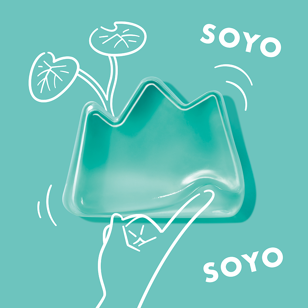

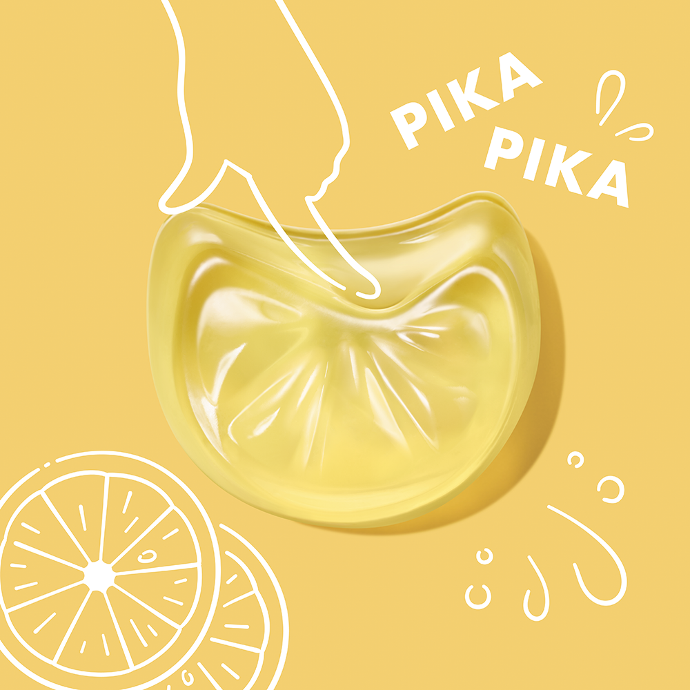
The form itself captures the fun, pop-like feel of gummy candy while remaining ergonomic and easy to hold. With three variations featuring different skincare ingredients, the lineup evokes the same excitement as choosing a makeup shade, letting users pick the one that best suits their skin.
To visually express the soft, springy texture even in still images, illustrations are combined with dynamic photography.

To help consumers easily understand the novel usage, described as “simply glide HADAGUMI over wet skin and rinse off,” a comic-style How To illustration was created.
This visual approach is applied consistently across the package, key visuals, and the website.
CREDITS
PRODUCT DESIGN
PRODUCT CREATIVE DIRECTOR MIDORI YAMADA(SHISEIDO CREATIVE)
PRODUCT DESIGNER QIANYA XU(SHISEIDO CREATIVE)
COPY WRITER ERIKO TSUTSUMI(SHISEIDO CREATIVE)
ACCOUNT EXECUTIVE SAKI MICHIMOTO(SHISEIDO CREATIVE)
COMMUNICATION DESIGN
CREATIVE DIRECTOR / COPY WRITER ERIKO TSUTSUMI(SHISEIDO CREATIVE)
ART DIRECTOR MIDORI YAMADA(SHISEIDO CREATIVE)
ACCOUNT EXECUTIVE SAKI MICHIMOTO(SHISEIDO CREATIVE)
PHOTOGRAPHER (KV / PRODUCT CUT) TAKAAKI UBA(SHISEIDO CREATIVE)
PHOTOGRAPHER (OTHER CUT) MAKI OTANI(SHISEIDO CREATIVE)
ILLUSTRATOR Hama-House