IHADA
REPACKAGING
Enhancing brand value and creating an attractive
retail display through repackaging.
PACKAGE DESIGN
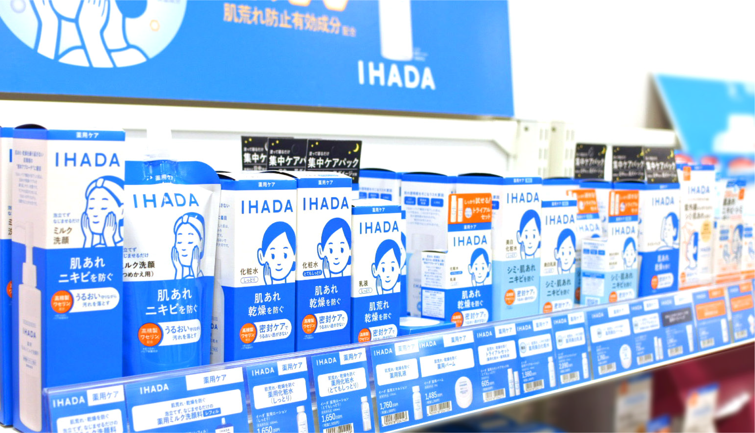
IHADA is a skincare brand that includes pharmaceutical-grade products to address skin issues that regular cosmetics can't solve. Popular in drugstores, the brand celebrates its 14th anniversary with fresh repackaging.
The challenge was that, as the product range expanded, the brand's message became harder to communicate clearly. We simplified the design to make it more visible and easily understood in-store. The character "Hada-ko," IHADA’s central figure, remains essential to the brand's identity.
The design concept embodies the notion of "Your trusted ally for skin concerns," aspiring to serve as a reliable companion in times of need. The newly designed packaging encapsulates the intention to instill confidence in customers, fostering a sense of trust in the product with ease.
The lineup includes three series: Medicated, Protective, and Treatment. Inspired by the clarity and trust found in designs like medical charts and prescription bags, our approach ensures that the products are both approachable and easy to use. The brand's blue, paired with white for trust and orange for positivity, creates a simple yet impactful color scheme.
CREDITS
PRODUCT DESIGN
CREATIVE DIRECTOR KAORI KONDO(SHISEIDO CREATIVE)
ART DIRECTOR EMIKO SHIOTA(SHISEIDO CREATIVE)
ILLUSTRATOR NORITAKE

