NEW
EUDERMINE
NEW
EUDERMINE
NEW
EUDERMINE
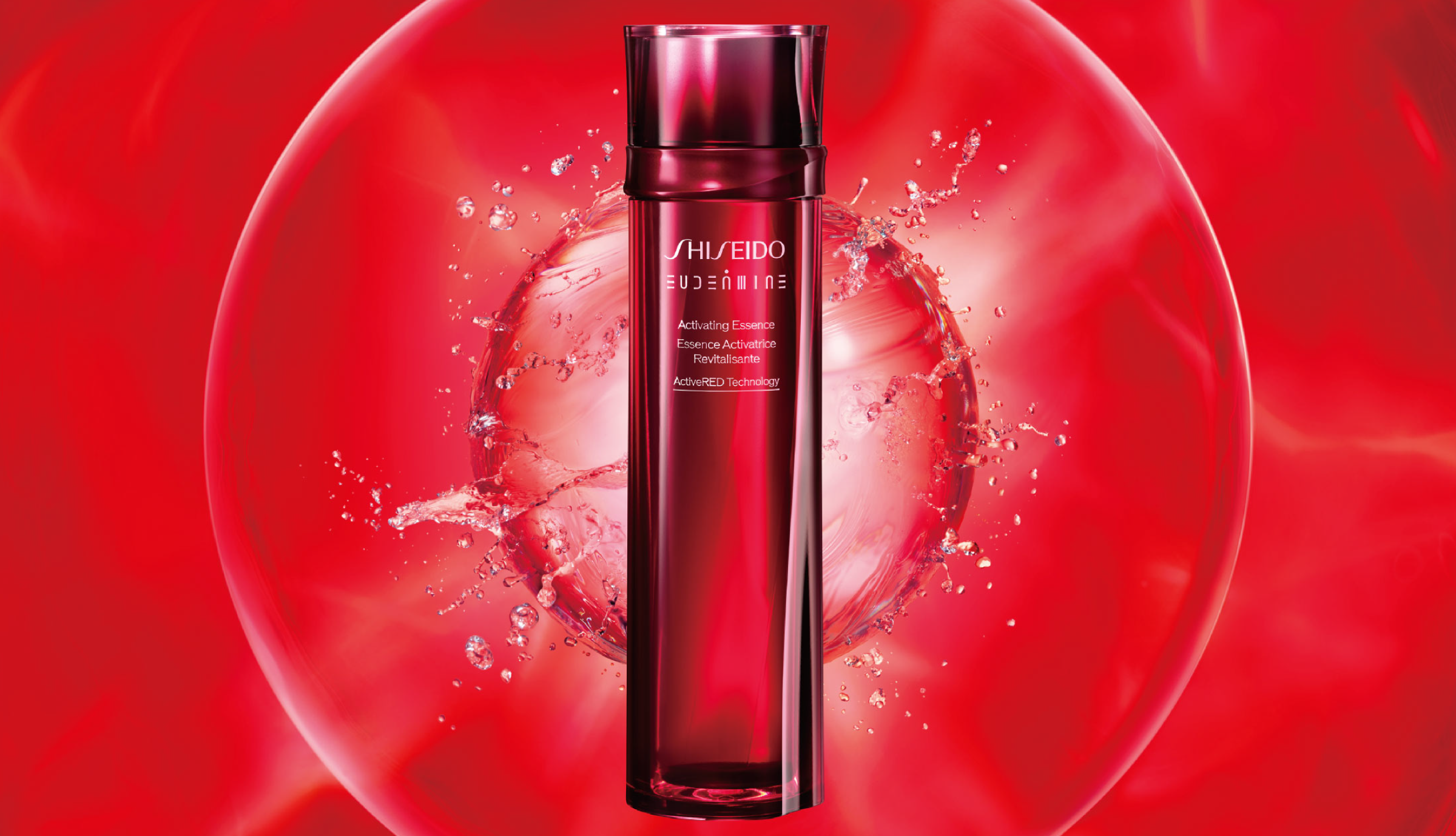
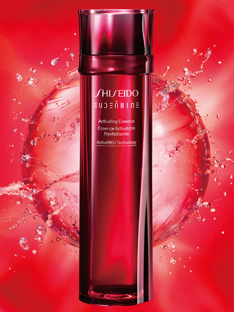
As a starting point and a symbol of the beauty of life Inheriting "red."
The original Eudermine was launched in 1897 as Shiseido's first lotion and was popularly known as "Shiseido's Red Water" at the time. Since then, the product has undergone numerous renewals and has become an extremely long-selling product that continues to be loved by customers worldwide. The creative concept for this first renewal since 1997, was "water of beauty of life." The "red" symbolizes the beauty of life inherited from generation to generation, and the form of the product captures the momentary flow of water in motion.
The world's first use of LiquiForm® in cosmetics.
The new refill container uses LiquiForm®, the world's first for cosmetics. It represents a technology that simultaneously fills the container with the contents and molds it instead of setting it by air. This method helps reduce the environmental burden. In addition, the two-piece structure of the main container and refill container allows the repeated use of the main container. It significantly reduces the amount of plastic that we need to dispose of.
We reinterpreted the symbolic logotype for global Eudermine.
We created the logo by combining primitive geometric shapes according to simple rules. The image of the spherical cap, which was the symbol of Eudermine, is incorporated in the dot at the center of the logo. We placed the same logo in a circular shape on the ring part. The logo intends to raise expectations of the high efficacy of the product when used.
CREDITS
PRODUCT DESIGN
- CREATIVE DIRECTOR / ART DIRECTOR / DESIGNER
- Mao Komai (MA·DO Inc.)
KEY VISUAL
- EXECUTIVE CREATIVE DIRECTOR
- Toshihiko Tanabe
- ART DIRECTOR
- Yuki Tsutsumi (Dentu Inc.)