AQUA LABEL
AQUA WELLNESS SERIES
AQUA LABEL
AQUA WELLNESS SERIES
AQUA LABEL
AQUA WELLNESS SERIES
Designing AQUA LABEL’s wellness series.
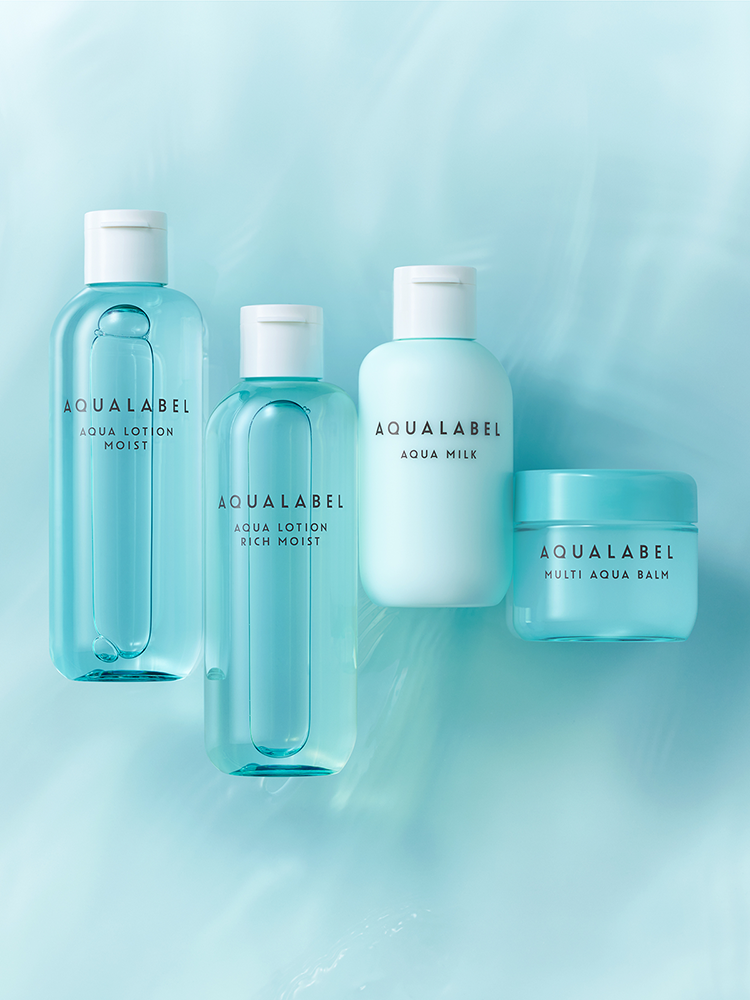
In August 2011, AQUA LABEL introduced a new skincare series for consumers with skin health concerns. The lineup includes a lotion, emulsion, and balm that can be used on both face and body. All products are formulated with amino acids derived from fermentation.
Shiseido Creative designed everything from packaging to communications.
As the desire for “healthy beauty” evolves under the COVID-19 pandemic, we strive to deliver new experiences that enrich the lives of consumers everywhere.
PRODUCT DESIGN
The products are inspired by “Japanese wisdom” — incorporating the blessings of nature to boost health benefits, fermented extracts inspired by the Japanese diet, and moisturizing ingredients linked to Japan’s four season.
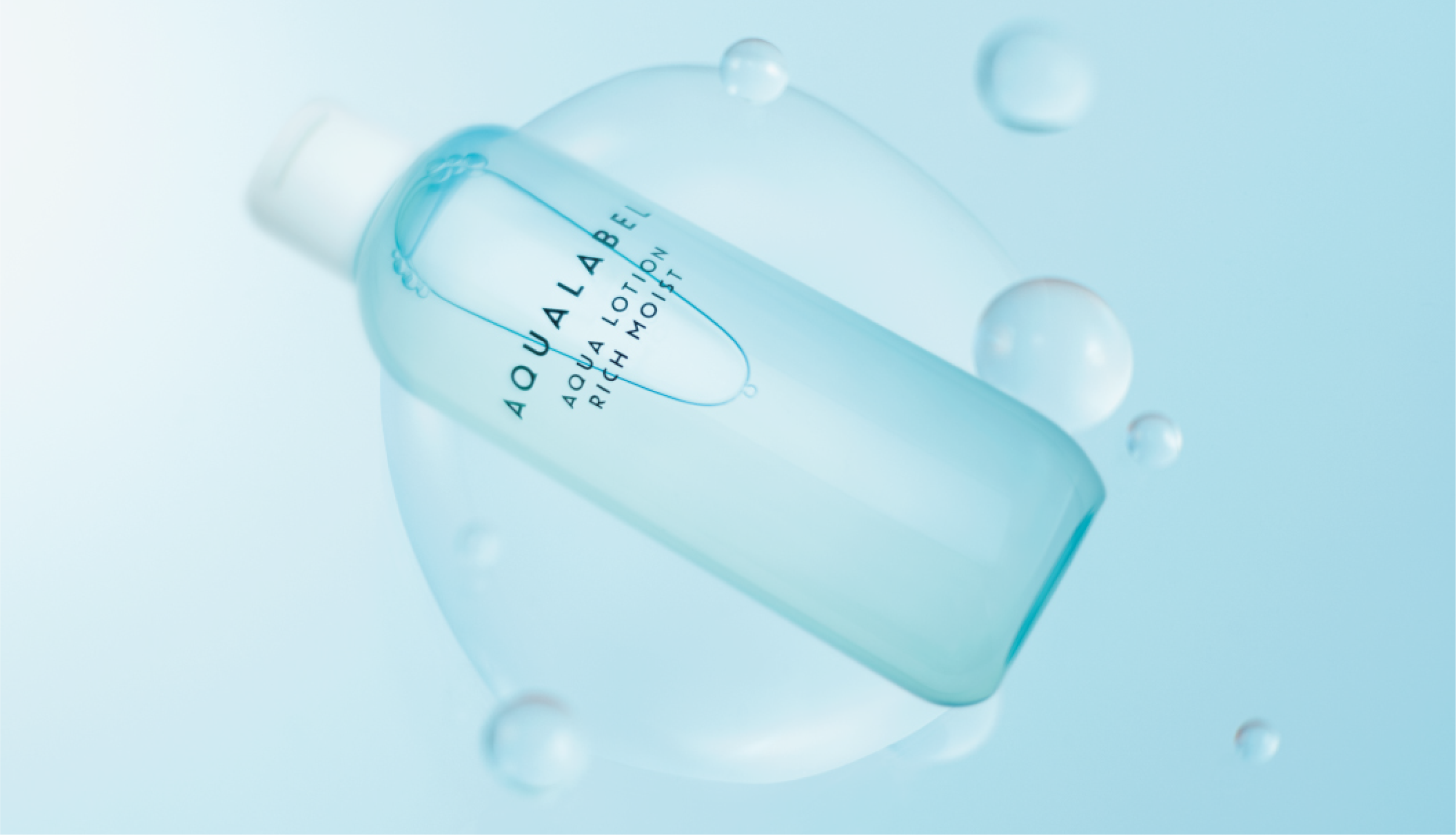
The bottle design is inspired by water, with an asymmetrical form that gives a pleasant shimmer. By adopting colors that exist in nature, we created an appearance that brings the product concept to life.
To ensure a sustainable product that respects the beauty of nature, refills and bottles are partially made from plant-derived plastics, created by fermenting sugarcane pomace to reduce CO2 emissions.
COMMUNICATION DESIGN
At Shiseido Creative, our packaging, communication, and space teams work closely to ensure consistency in every asset.
For AQUA WELLNESS, we delivered a 360 campaign under one concept, with visuals linked to the water drop and fermentation process, and copy that communicates skin power.
DIGITAL CONTENTS DESIGN
To share every aspect of the brand with consumers, including product development, ingredient selection, package design, and product features. We created various digital assets. These assets were then shared on our renewed homepage and social media accounts, ensuring a consistent, transparent worldview that clearly communicates the brand.
CREDITS
PRODUCT DESIGN
- CREATIVE DIRECTOR
- Kanako Kawai (SHISEIDO CREATIVE)
- ART DIRECTOR
- Yuka Nagasaki (SHISEIDO CREATIVE)
- DESIGNER
- Ayami Tokuhisa (SHISEIDO CREATIVE)
COMMUNICATION DESIGN
- CREATIVE DIRECTOR
- Shoko Tanaka (SHISEIDO CREATIVE)
- ART DIRECTOR / DESIGNER
- Reiko Shiga (SHISEIDO CREATIVE)
- COPY WRITER
- Shoko Tanaka (SHISEIDO CREATIVE)
- PRODUCER
- Yayoi Kambayashi (SHISEIDO CREATIVE) Kiyoka Oosaku (SHISEIDO CREATIVE)
- PHOTOGRAPHER
- Mikiya Takimoto (MIKIYA TAKIMOTO PHOTOGRAPH OFFICE) Shotaro Ito (SHISEIDO CREATIVE) Kiyoka Oosaku (SHISEIDO CREATIVE)
DIGITAL CONTENTS DESIGN
- CREATIVE DIRECTOR
- Shoko Tanaka (SHISEIDO CREATIVE)
- ART DIRECTOR
- Reiko Shiga (SHISEIDO CREATIVE)
- PRODUCTION
- BBmedia Inc. amana