EFFECTIM
Branding
EFFECTIM
Branding
EFFECTIM
Branding
Creating a consistent worldview
from product to communication
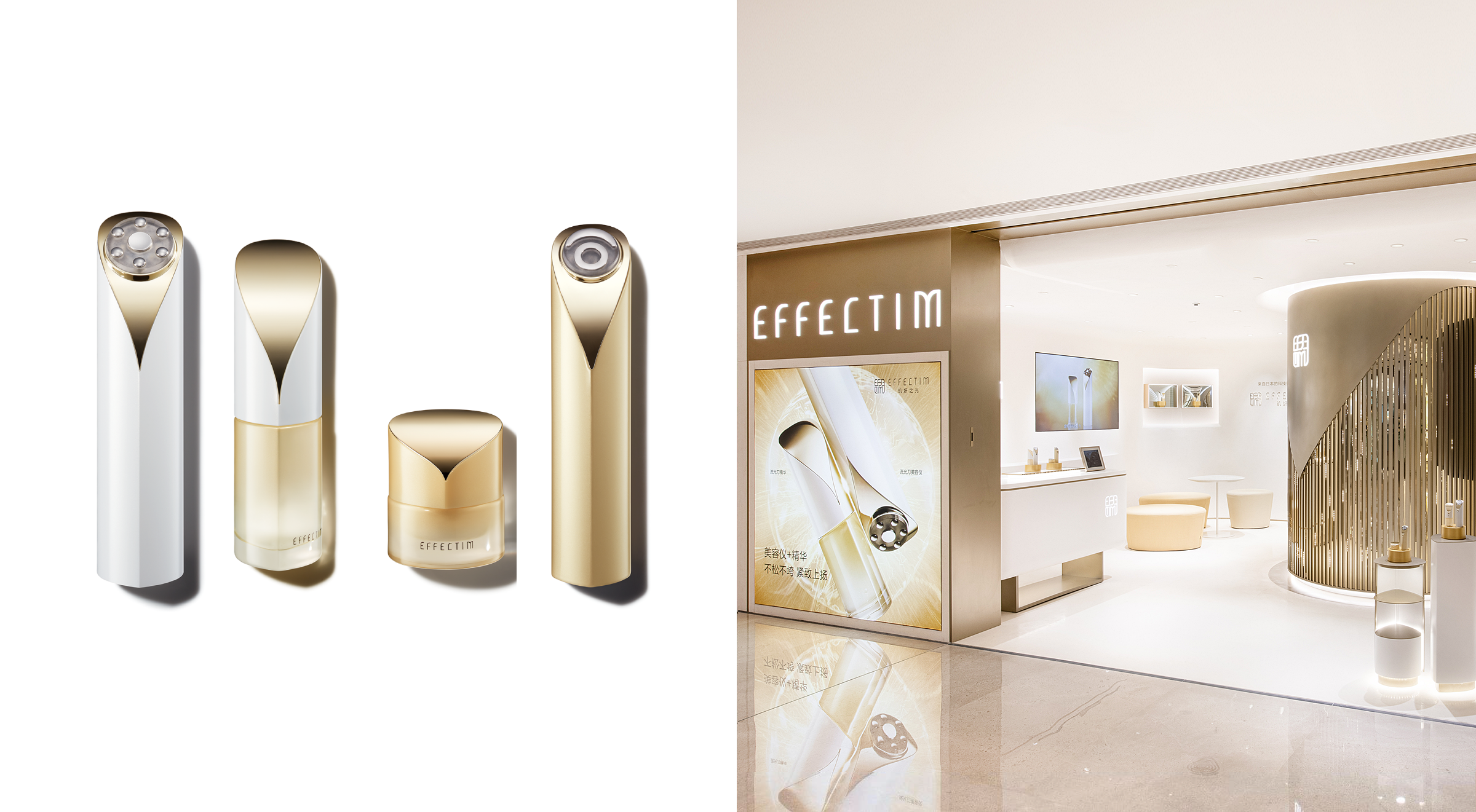
EFFECTIM, a joint venture between Shiseido and Ya-Man, operates in Japan and China. As an expert in anti-aging care from Japan, the brand aims to become a "life partner for skin”, supporting peoples desire to shine throughout life.
Shiseido Creative worked on the overall branding, from product design to communication design.
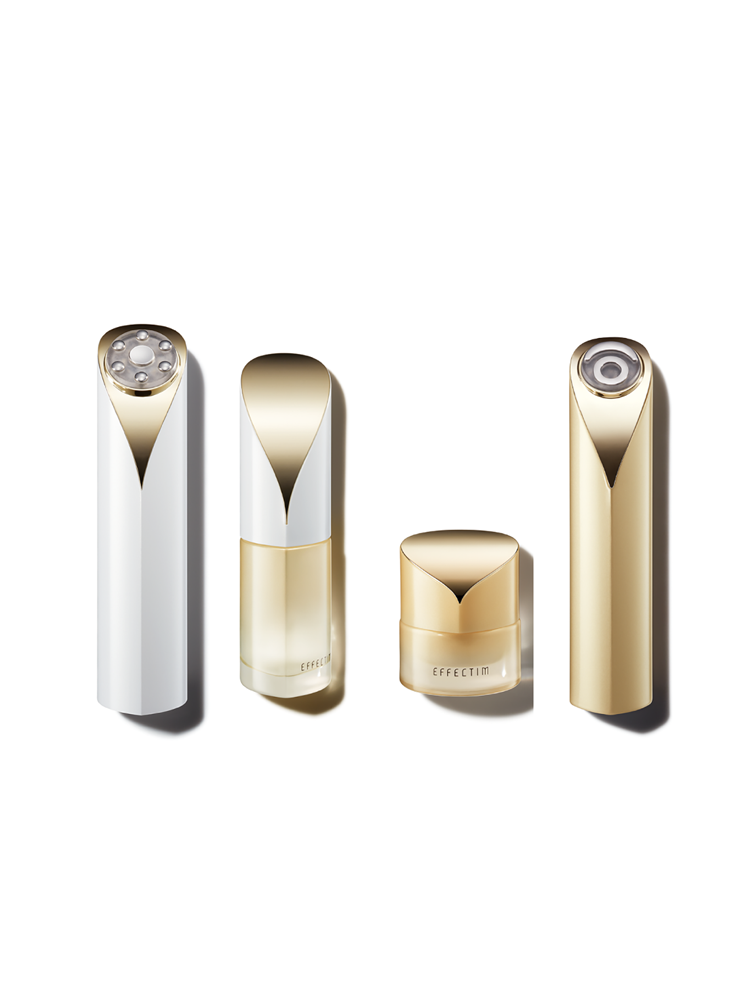
Product Design
A fusion of Japanese modernism and functionality
The concept of combining these two elements is woven into all our designs, including product. Straight lines and curves, simple yet memorable images, organic aesthetics and a sense of the future. By combining various elements, EFFECTIM achieves a unique beauty.
Logo Design
The brand's intention to deliver "effective" skincare is directly reflected in the name EFFECTIM.
The straight lines in the original typeface symbolize physical energy and technology, while the curved lines represent beauty and grace.
The logo is a testament to our continued pursuit of effectiveness through the precise analysis of skin, and the combination of the letters EFFECTIM, reminiscent of an IC chip, symbolizes the future of skin.
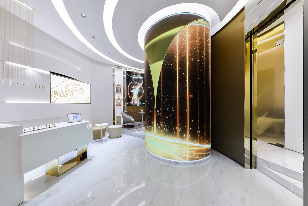
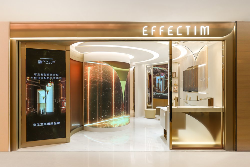
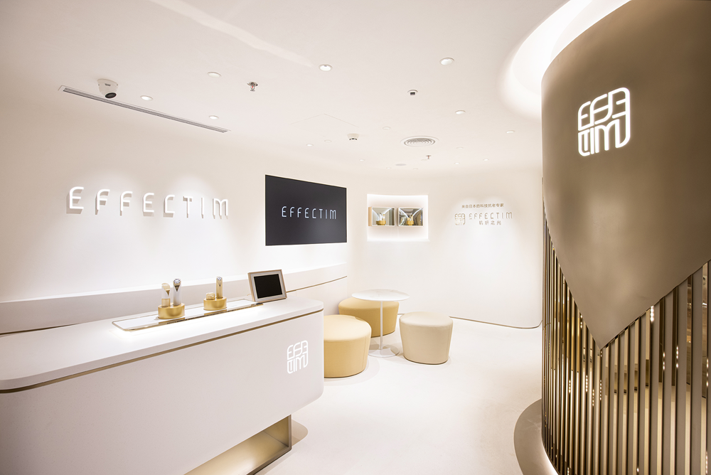

Retail Design
We aimed to integrate the AWASE philosophy into retail, where both functional and emotional benefits overlap. The cutting-edge skin analysis is positioned as our "POD" and is presented as an icon to attract customers.
The retail designs combine a dignified appearance with a high-quality, relaxed atmosphere.
CREDITS
PRODUCT DESIGN
- CREATIVE DIRECTOR
- Shoko Yoshida (SHISEIDO)
- ART DIRECTOR
- Mao Komai (Currently at MA•DO Inc.)
- DESIGNER
- Akira Muraoka (Currently at MA•DO Inc.)
LOGO DESIGN
- CREATIVE DIRECTOR
- Shoko Yoshida (SHISEIDO)
- ART DIRECTOR
- Mao Komai (Currently at MA•DO Inc)
- DESIGNER
- Misaki Nagatake (SHISEIDO CREATIVE)
AWASE DESIGN PHILOSOPHY
- REATIVE DIRECTOR
- Shoko Yoshida (SHISEIDO)
- ART DIRECTOR
- Misaki Nagatake (SHISEIDO CREATIVE)
- DIRECTOR
- Sho Mizui
- CINEMATOGRAPHER
- Shotaro Ito (SHISEIDO CREATIVE)
- MUSIC
- Shinichi Suda
- EDIT
- Sho Mizui
- PRODUCTION
- Tower Film
- PRODUCER
- Daisuke Masuda
- PRODUCTION MANAGER
- Cui Xuemei Aoyama Miki
RETAIL DESIGN
- REATIVE / ART DIRECTION
- Akihiro Yamada (SHISEIDO CREATIVE)
- DESIGN
- DC International
- PRODUCTION
- toppan(Japan / China)